DH – Mobilni

Analysis of user problems, the Slovenian market and competing mobile banks.

DH Mobilni is a banking app also used by older and less digitally confident people. By analysing the existing experience, the market and competing solutions, I identified the key obstacles and developed a redesign concept that keeps the brand's visual guidelines and stays realistic to build.
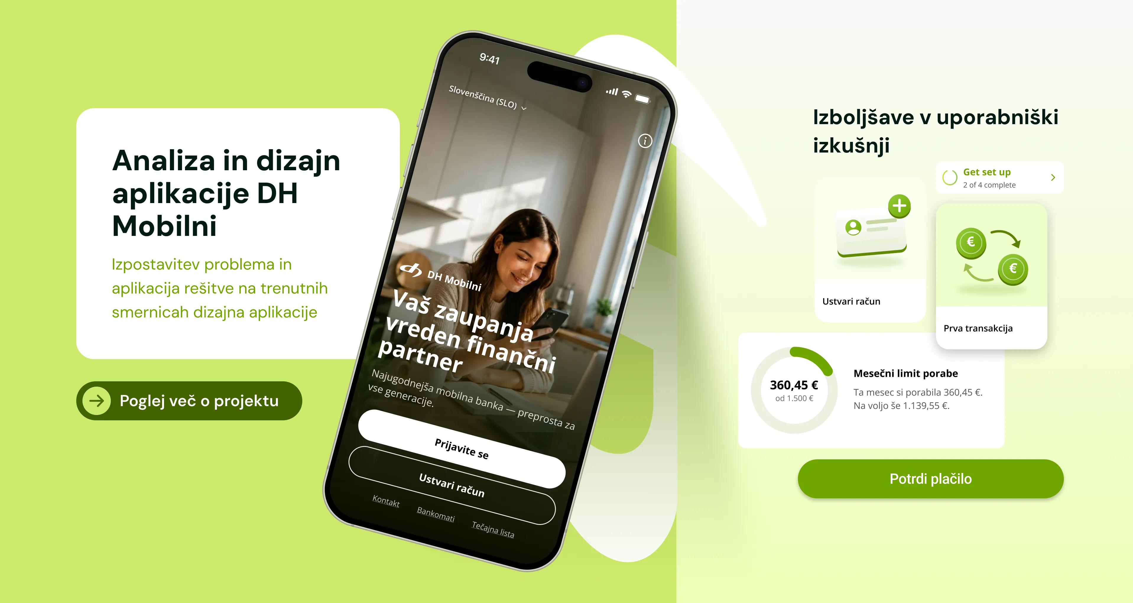
Predstavitvena pasica projekta DH Mobilni z zaslonom aplikacije in izboljšavami uporabniške izkušnje

PROCESS

01

Understanding the app

02

Defining the problem

03

Market research

04

Comparative analysis

05

Concept and design

Defining the problem

The DH mobile app is also used by older customers who rely on it for everyday banking. Observing a user over 60 revealed crowded screens, small buttons, banking jargon and promotional content appearing mid-transaction. This left her hesitant while using the app and worried she would choose the wrong option.

In the context of this project, users who need more support include:

- people over 50 using mobile banking for the first time;
- people with little experience of digital services;
- users who regularly use only a few apps on their phone;
- users not yet familiar with the Slovenian banking system or language.

Key principle

The app should simplify everyday banking and give the user a sense of safety, trust and clear information.

Research question

How can we improve the mobile banking experience for users who have little experience with mobile banking, are less confident with technology, or do not speak fluent Slovenian?

Market research

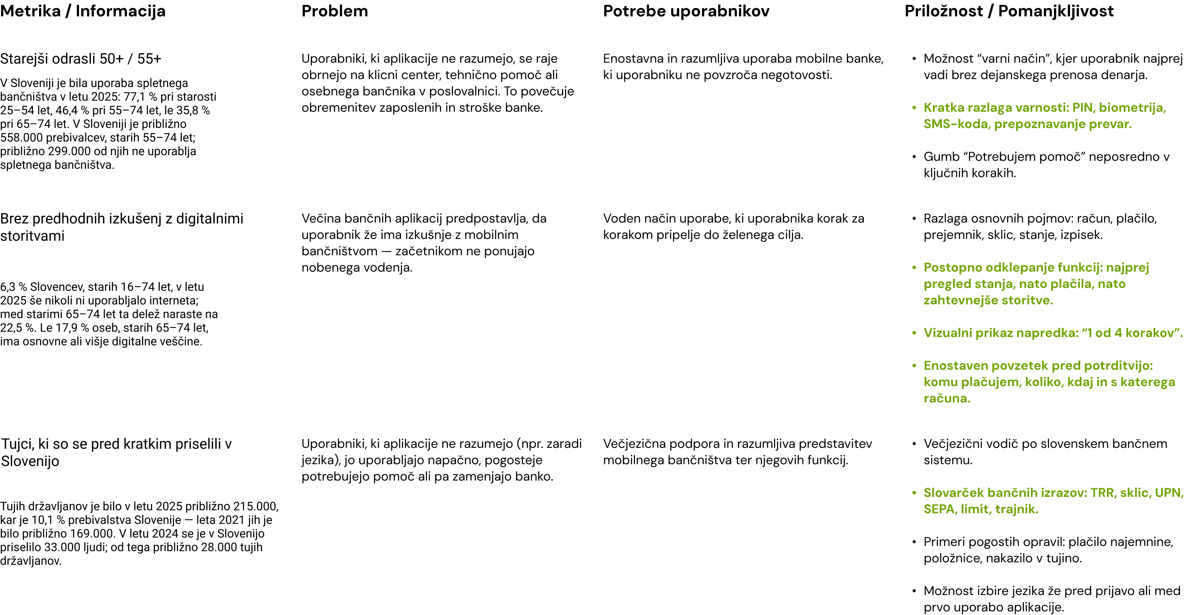
Raziskava uporabnikov za projekt DH Mobilni

A personalised level of help: on first use, the app asks whether the user wants a basic, guided or advanced experience.

How can we improve the user experience of a mobile bank for people who have little experience with mobile banking, are not confident with technology, or do not speak fluent Slovenian?

Comparative analysis

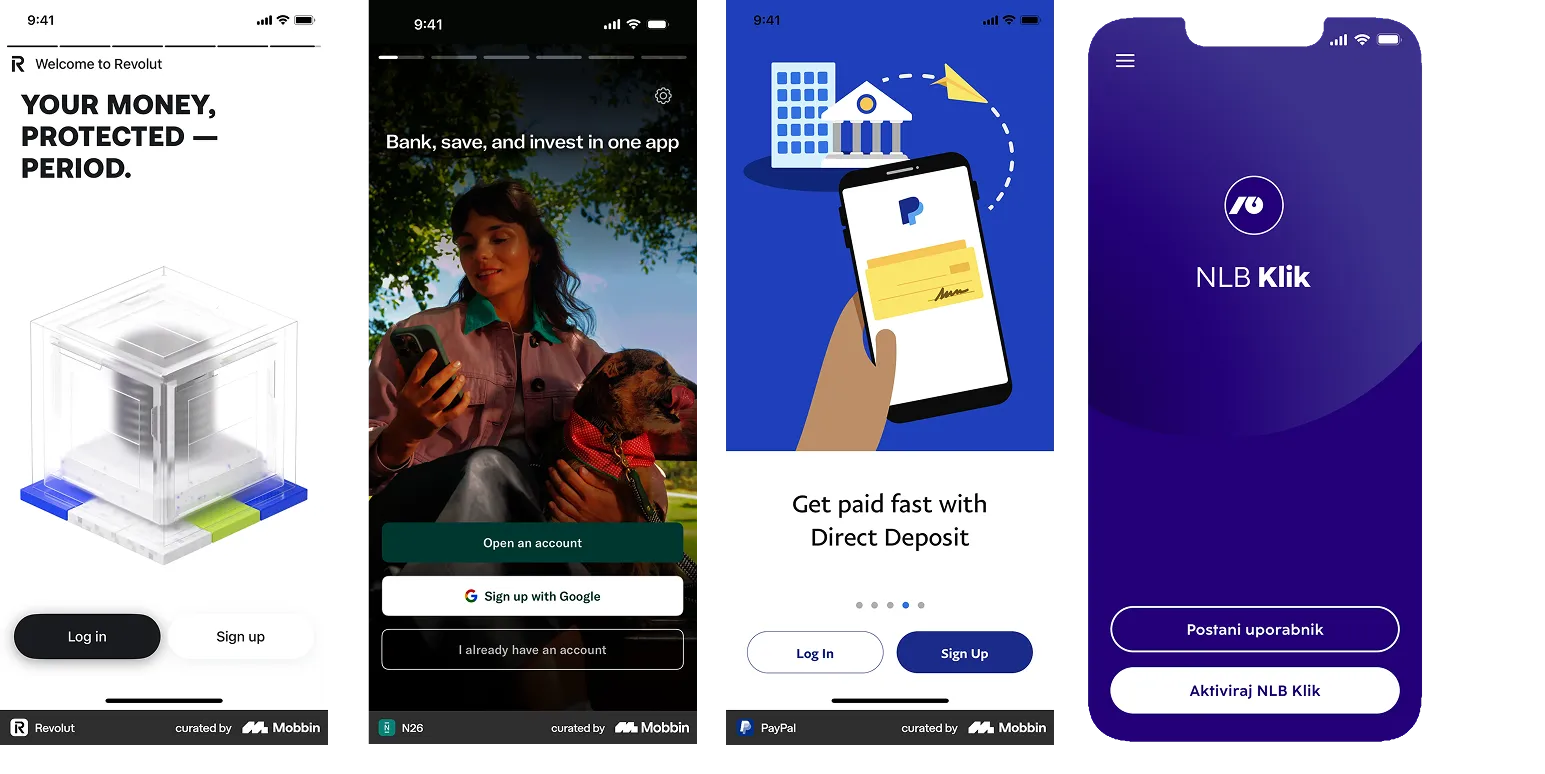
Analiza konkurenčnih mobilnih bančnih aplikacij: uvodni zasloni Revolut, N26, PayPal in NLB Klik

SHORTCOMING

Changing the language is neither visible nor simple enough.

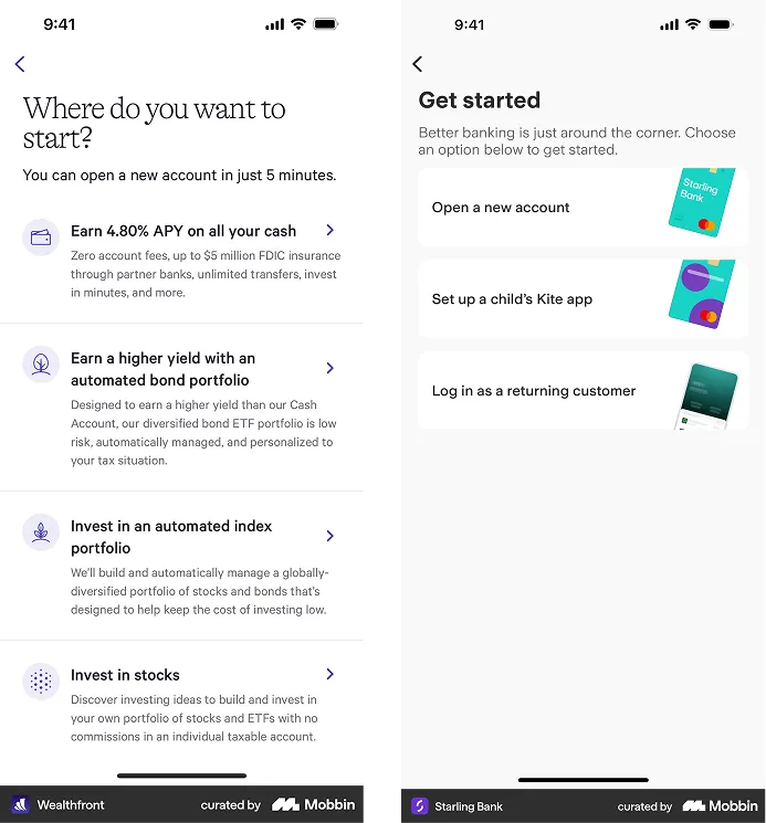
Analiza konkurenčnih mobilnih bančnih aplikacij

OPPORTUNITY

Help can be tailored to the user's level of experience.

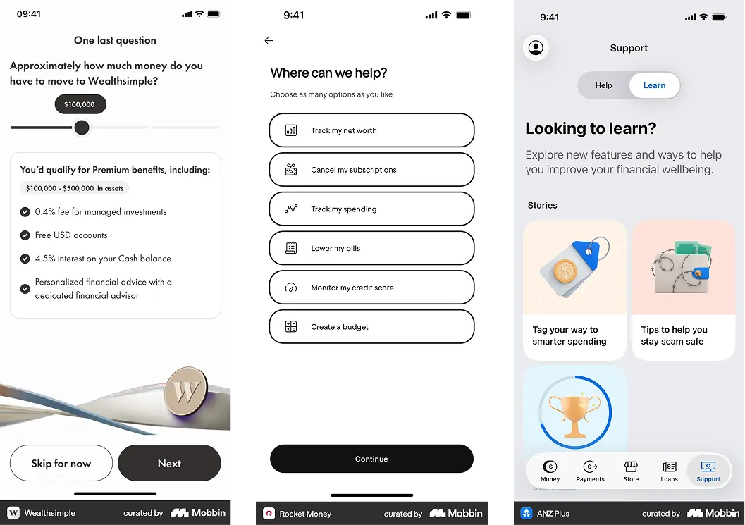
Analiza konkurenčnih mobilnih bančnih aplikacij

OPPORTUNITY

Step-by-step onboarding with extra explanation.

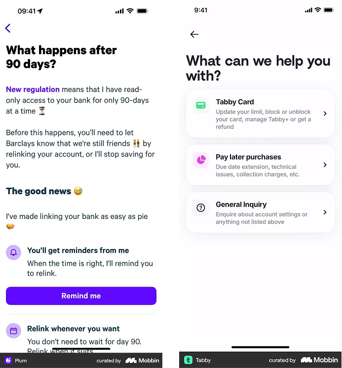
Analiza konkurenčnih mobilnih bančnih aplikacij

OPPORTUNITY

Explaining banking terms and how the app works.

Design

In the redesign I kept the existing visual guidelines and limited the scope of change to keep the solution realistic to build. I focused on a clearer hierarchy, larger elements, plainer language and help placed where the user actually needs it.
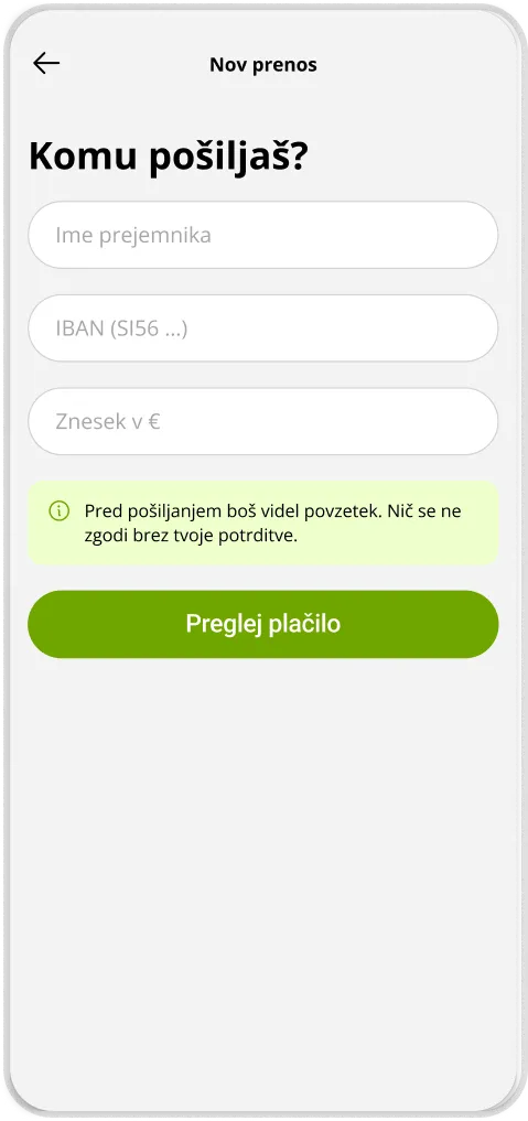
First contact with the app

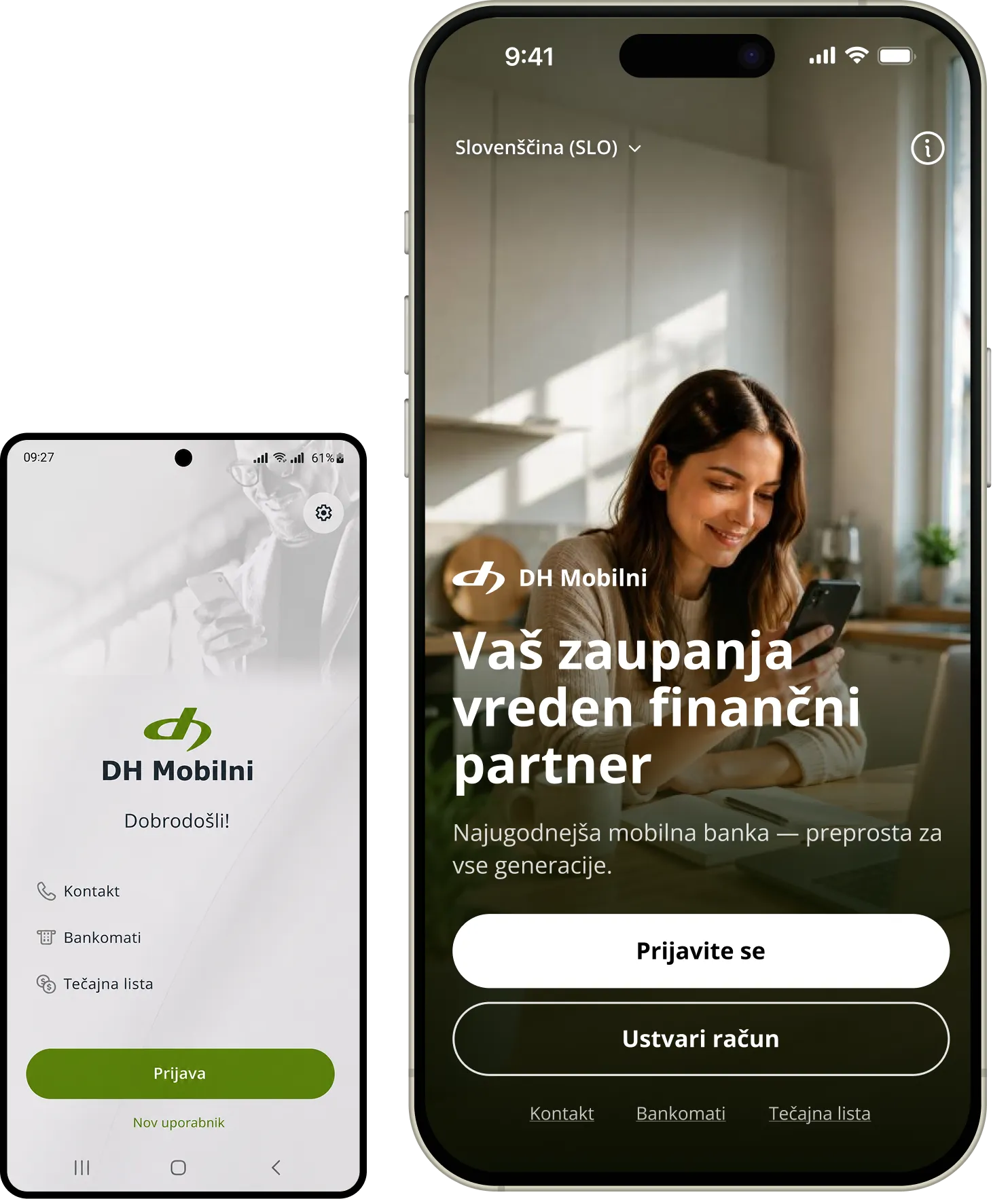
The existing login screen feels reserved and speaks mainly to experienced users. I added elements that welcome people and immediately explain where they are and what they can do:

a personal greeting instead of just a login form;

a photograph that adds warmth to the screen;

a clearly visible language option;

a clearer label for the “New user” button.

DH Mobilni: primerjava obstoječega prijavnega zaslona in prenovljenega predloga

Language choice and basic information

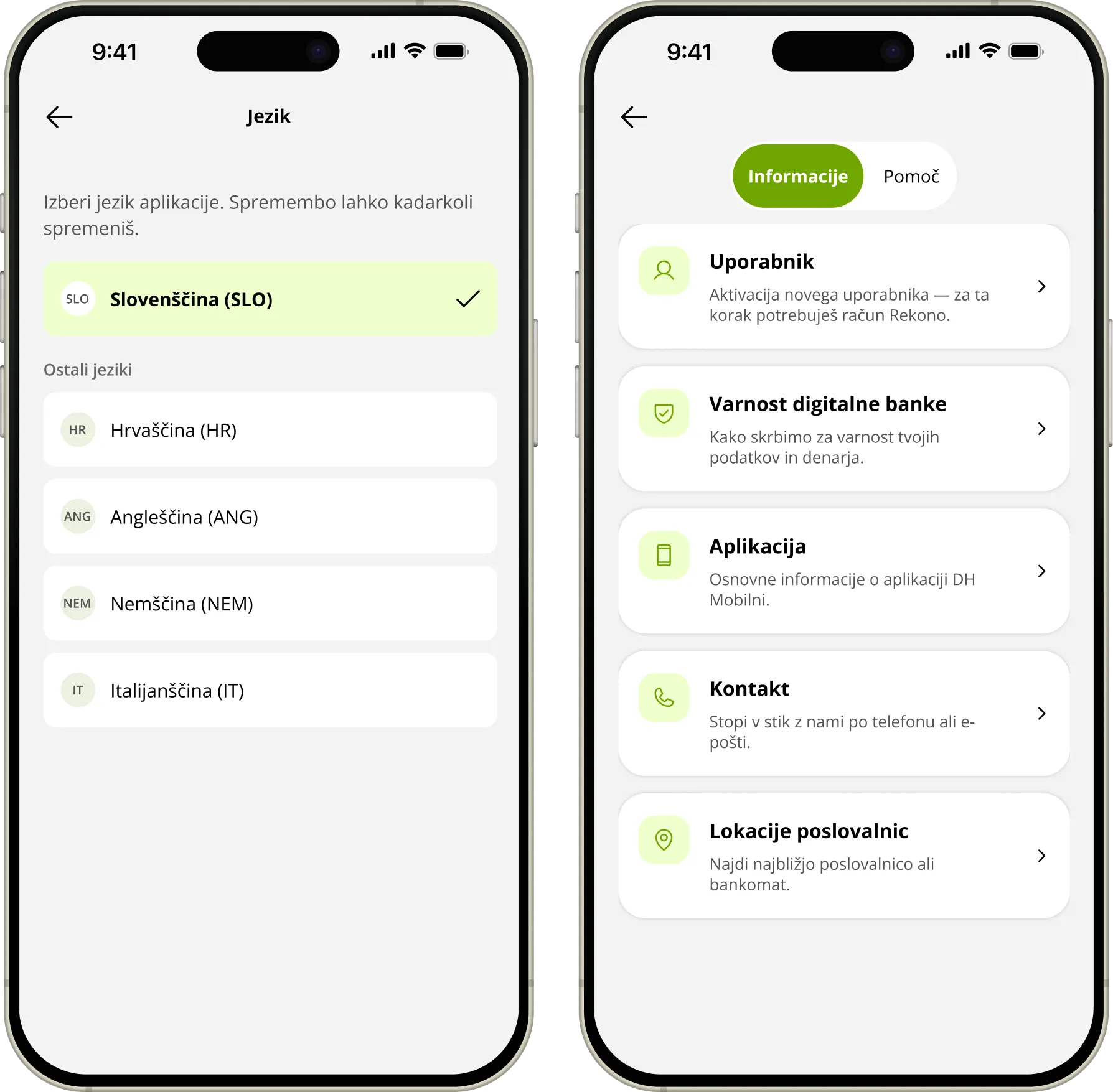
Because changing the language is buried deep in the settings, I added separate screens before login for choosing a language and introducing the app:

language choice before login;

a short overview of the app's features;

access to help and contact details without logging in;

large, clearly labelled options.

DH Mobilni: predlog oblikovanja zaslona aplikacije

Creating an account

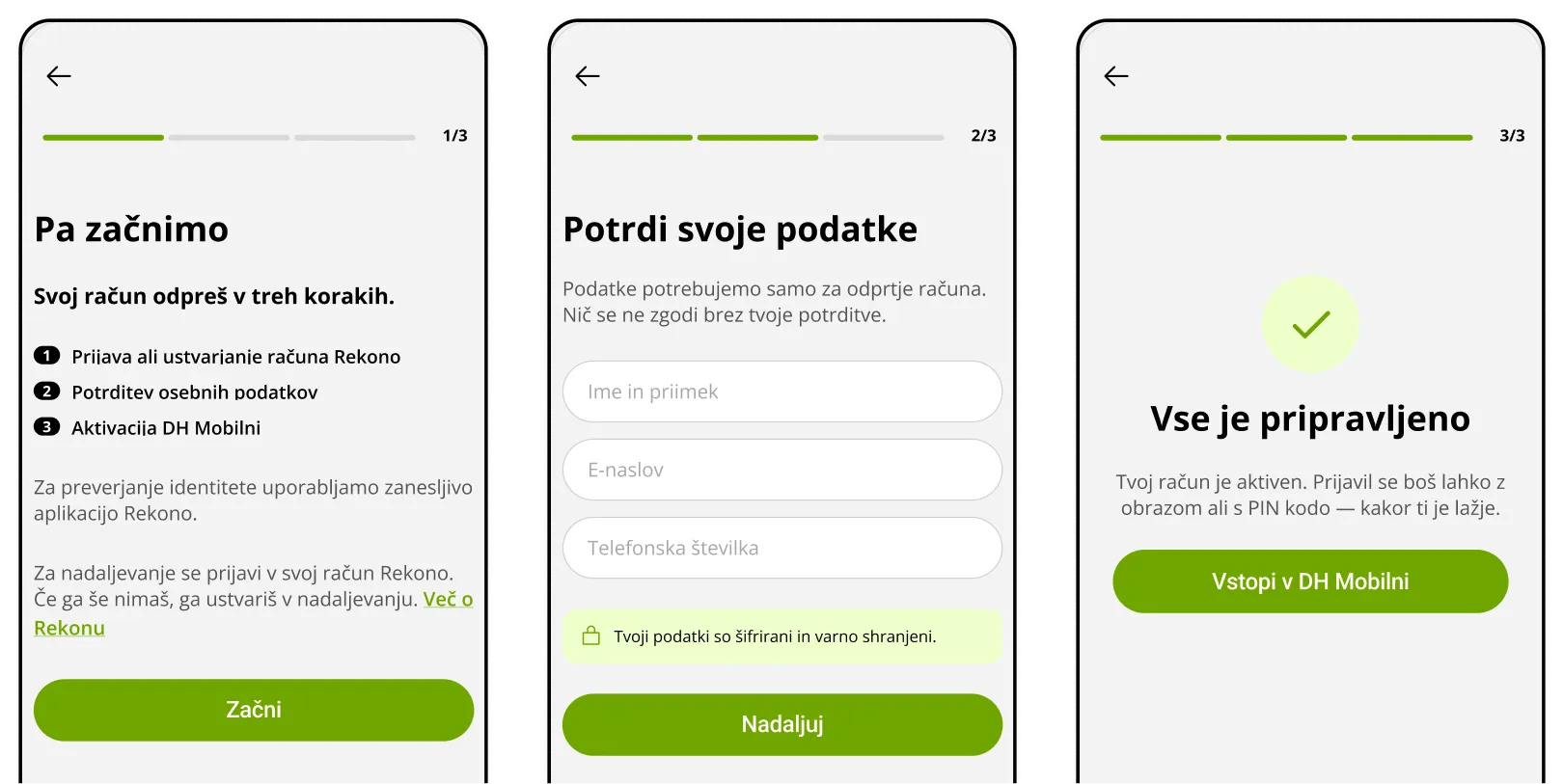
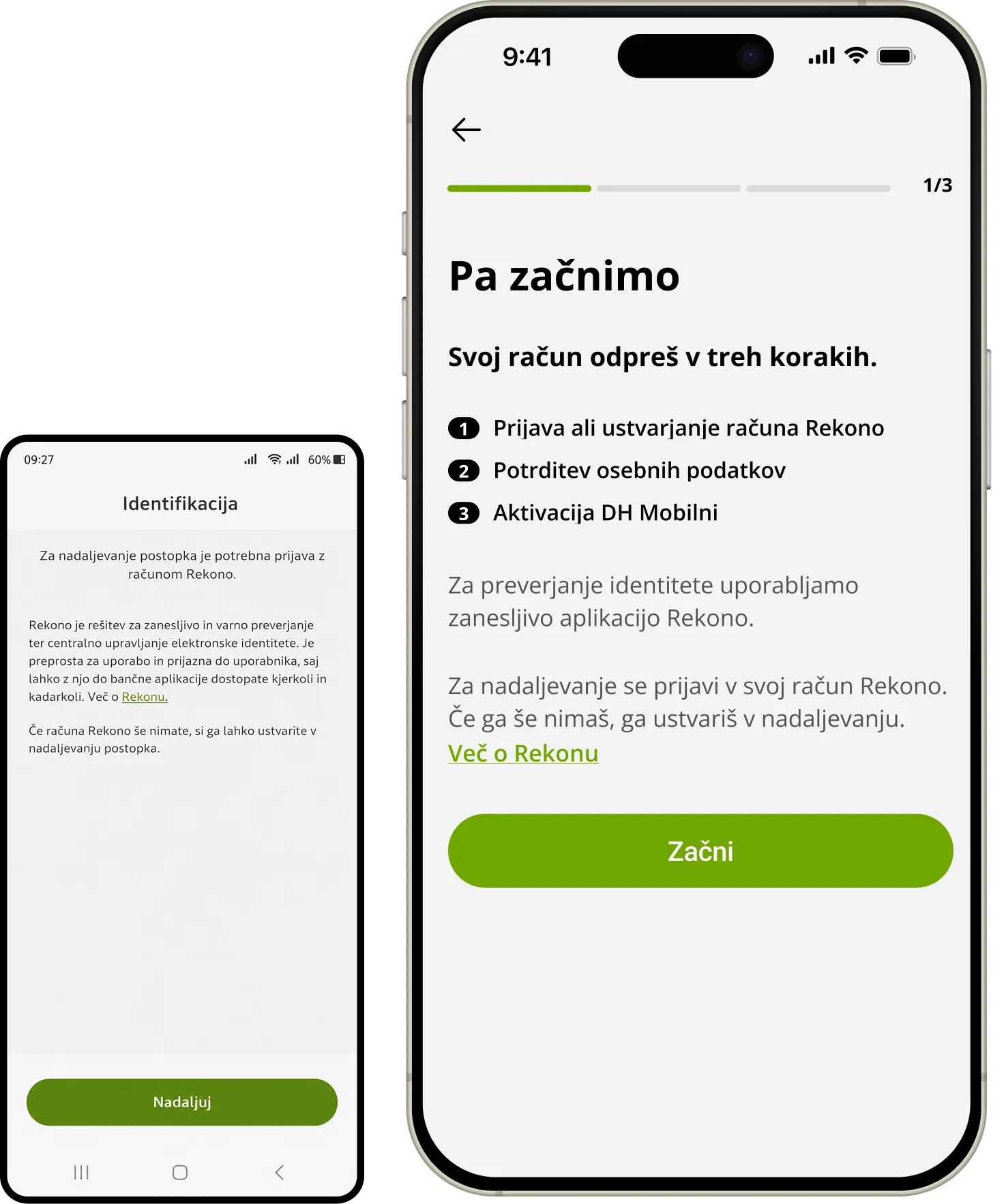
The “New user” button leads straight to the identification screen, where people meet the Rekono app for the first time without knowing what comes next. I split the process into clear steps:

showing progress and the remaining steps;

a short explanation of what Rekono is and why it is needed;

a numbered account-opening process;

a more personal and understandable tone.

DH Mobilni: predlog oblikovanja zaslona aplikacije

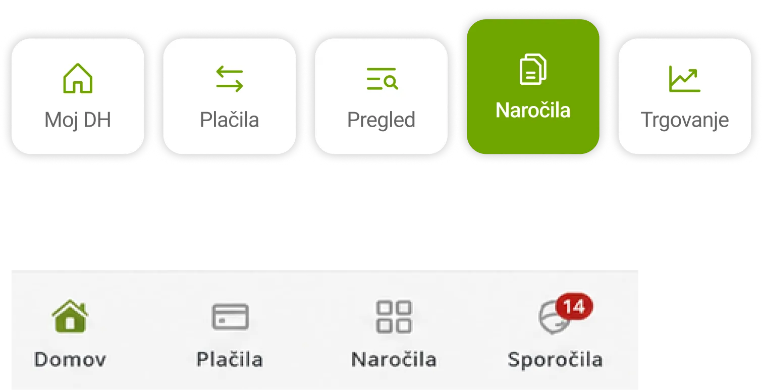
Toolbar

The toolbar holds many services with names that are hard to understand. To make it clearer, I proposed:

fewer options, ordered by how often they are used;

simpler names instead of banking jargon;

larger, more legible icons;

a clearly marked active item.

DH Mobilni: predlog oblikovanja zaslona aplikacije

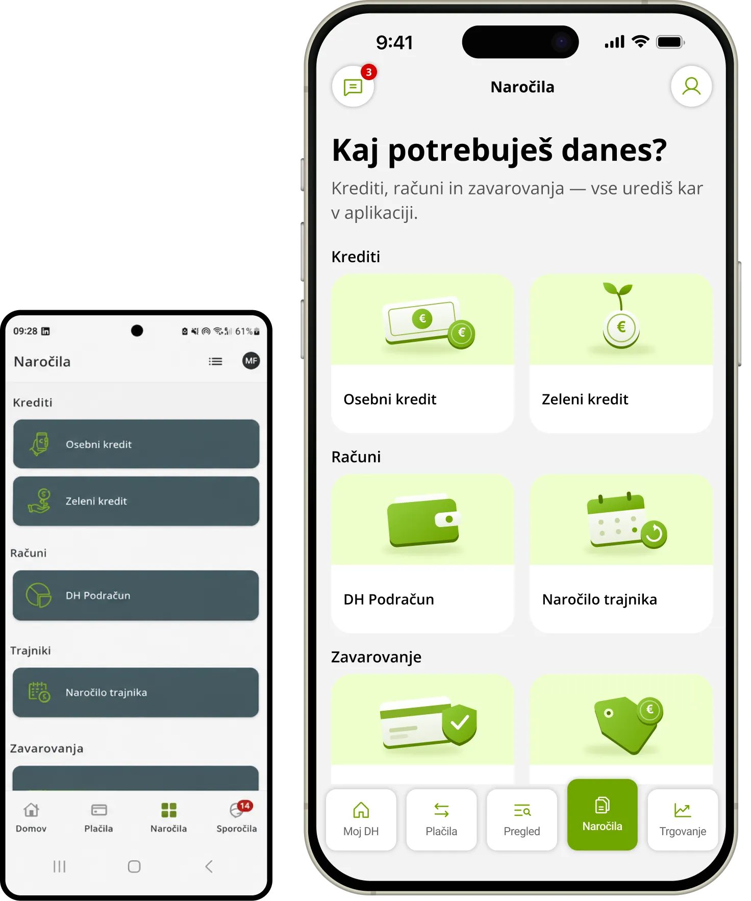
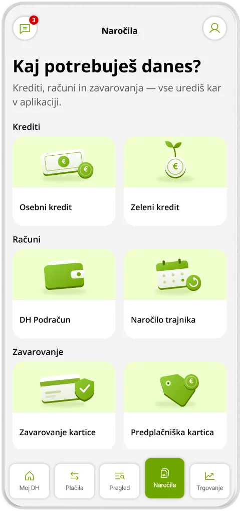
Orders

The existing screen assumes the user already knows the available options. I added introductory explanations and grouped the tasks more clearly:

a short explanation of what can be managed;

larger icons for faster recognition;

clearly styled interactive buttons;

tasks split into meaningful groups.

DH Mobilni: predlog oblikovanja zaslona aplikacije

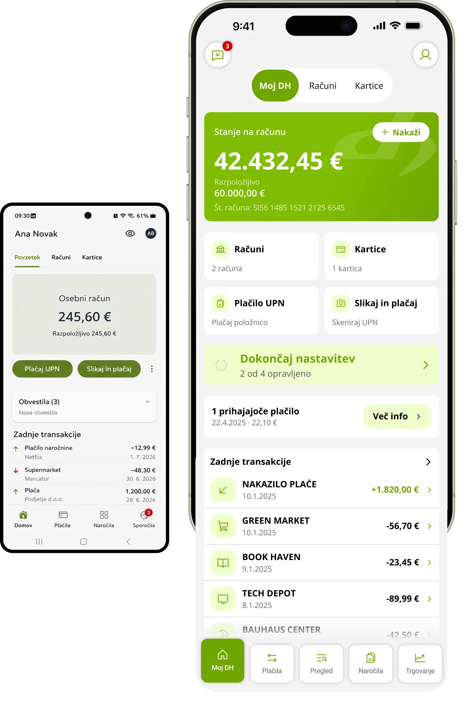
My DH

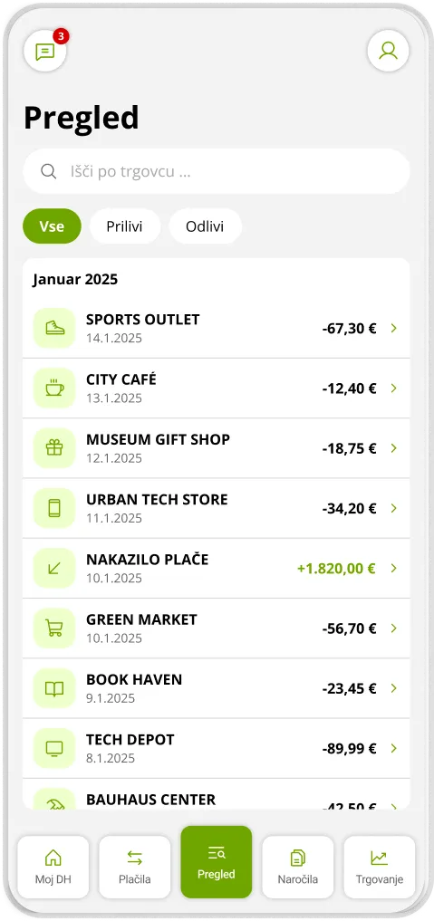
I designed the My DH screen as a personal home page where the user quickly finds the most important information and tasks:

balance and recent transactions in one place;

shortcuts to the most common tasks;

a personal greeting;

less visual noise and fewer promotional messages.

DH Mobilni: predlog oblikovanja zaslona aplikacije

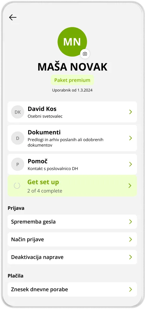
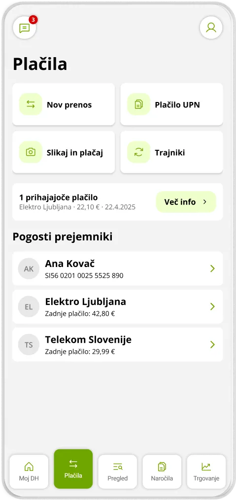
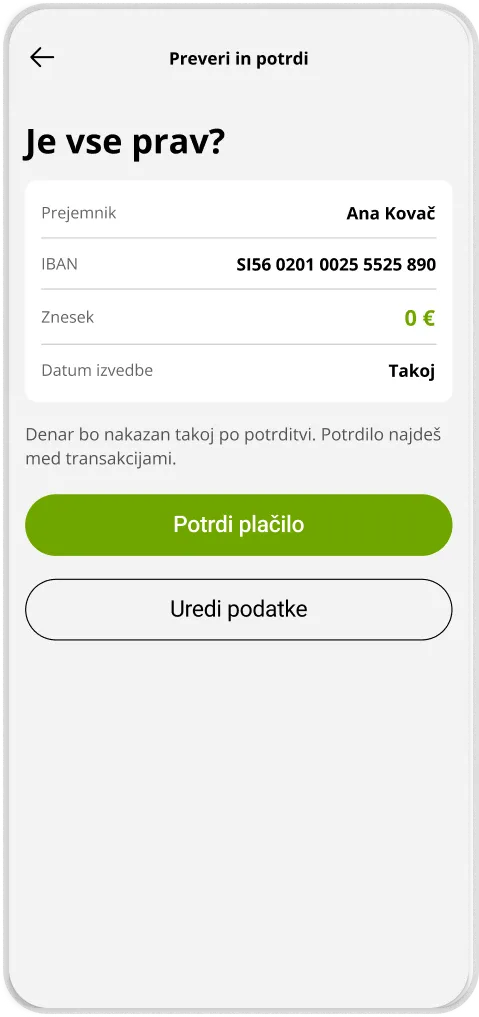
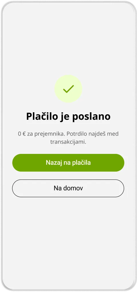
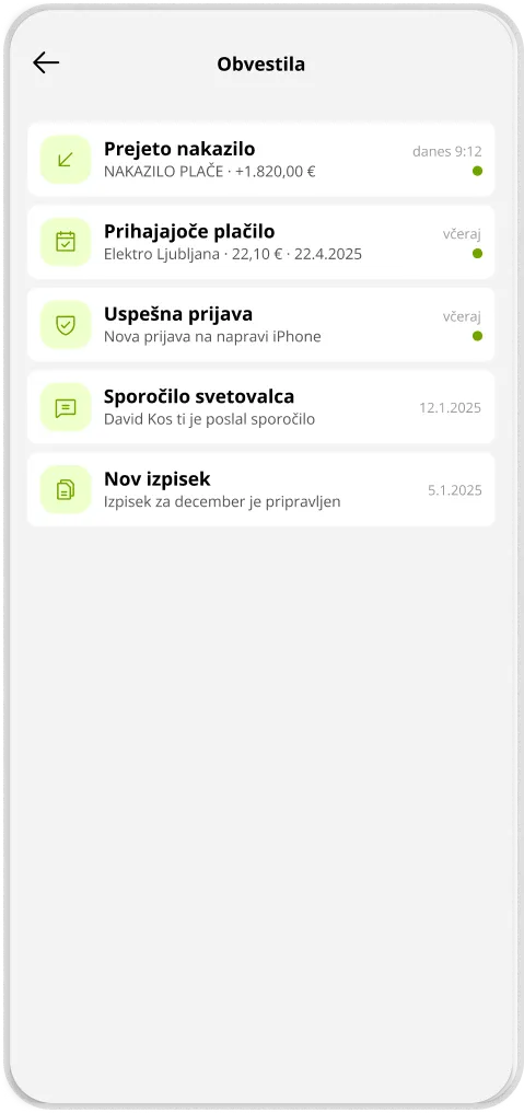
The redesign concept reduces the complexity of key tasks, offers help sooner, and improves both legibility and the sense of safety. The next step would be to test the prototype with a larger group of older and less digitally confident users, then iterate on the findings.

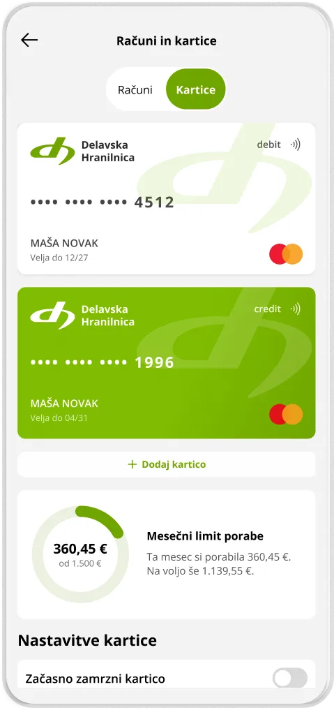
DH Mobilni: zaslon Računi in kartice s stanjem, prilivi in odlivi ter zadnjimi transakcijamiDH Mobilni: predlog prenovljenega zaslona aplikacijeDH Mobilni: predlog prenovljenega zaslona aplikacijeDH Mobilni: predlog prenovljenega zaslona aplikacijeDH Mobilni: predlog prenovljenega zaslona aplikacijeDH Mobilni: predlog prenovljenega zaslona aplikacijeDH Mobilni: predlog prenovljenega zaslona aplikacijeDH Mobilni: predlog prenovljenega zaslona aplikacijeDH Mobilni: predlog prenovljenega zaslona aplikacijeDH Mobilni: predlog prenovljenega zaslona aplikacije

Other projects